Overview
🔧 General Properties
The Custoplayer component is compatible with all video attributes. This means that you should be able to attach common video attributes/events like src, preload, onTimeUpdate, and onPlay to the Custoplayer component with no problem.
Controls Bar
The controls bar is the bar that contains all the Item Properties as shown with the green box in the image below:

Usage:
values={{
  controlsBar: {
    barColor: "rgba(28, 28, 28, 0.85)",
    animate: 'movement'
  },
}}
Controls Bar Properties
| Property Name | Required | Accepted Values | Description | Default |
|---|---|---|---|---|
| barColor | No | Any hex or rgb color code | Changes the background color of the controlsBar | 'rgba(28, 28, 28, 0.7)' |
| animate | No | "opacity" or "movement" | Changes the animation of the controlsBar when the video is hovered. Setting animate to "opacity" will do a simple fade in animation. Setting animate to "movement" will animate the controls bar from bottom -> up | "opacity" |
- The
barColorproperty changes the color of the controlsBar.- This also changes the default backgroundColor for the previewToolip.
- Accepts any hex or rgb color code.
- The
animateproperty changes how the controlsBar animates.- Accepts values of
"opacity"and"movement".- Setting animate to
"opacity"will do a simple fade in animation. - Setting animate to
"movement"will animate the controls bar from bottom -> up
- Setting animate to
- Accepts values of
📓 Item Properties
Item properties used to customize the video player are all put in the values property.
To understand how to customize a video player there is some general vocab which is helpful to understand as seen in the image below:
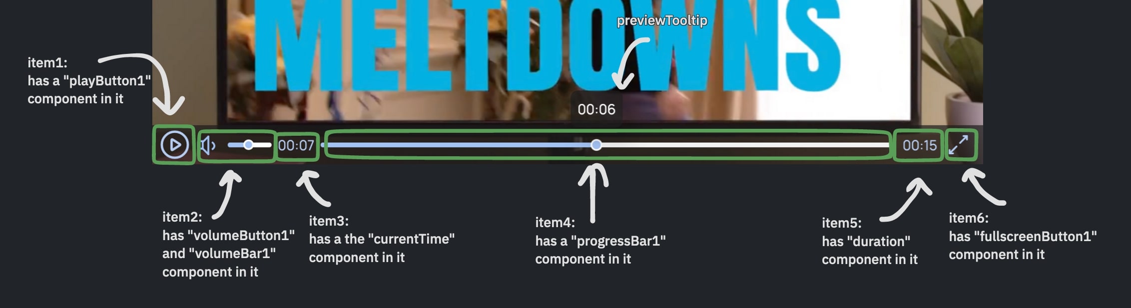
In the above image there are 6 green rectangles. Each rectangle represents a container where you can place a component. The above video uses 6 items, but the package supports a total of 7 items.
The are many components that can be put in a item container. Some of them are "fullscreenButton2", "volumeButton1", "currentTime", and "progressBar1". Components can be customized using property names that are unique to the component. For example, both the "currentTime" and "duration" components have a textColor property.
If a component name is suffixed with a number like 1 or 2, that means that the component has numerous types. For example, there are two fullscreenButton components, "fullscreenButton1" & "fullscreenButton2".
You can go to the bottom of the quick start page to see the above example in action with its code.
To learn more about components you can go to the components page